Spaces
[ Spaces ], 2010 | 2024
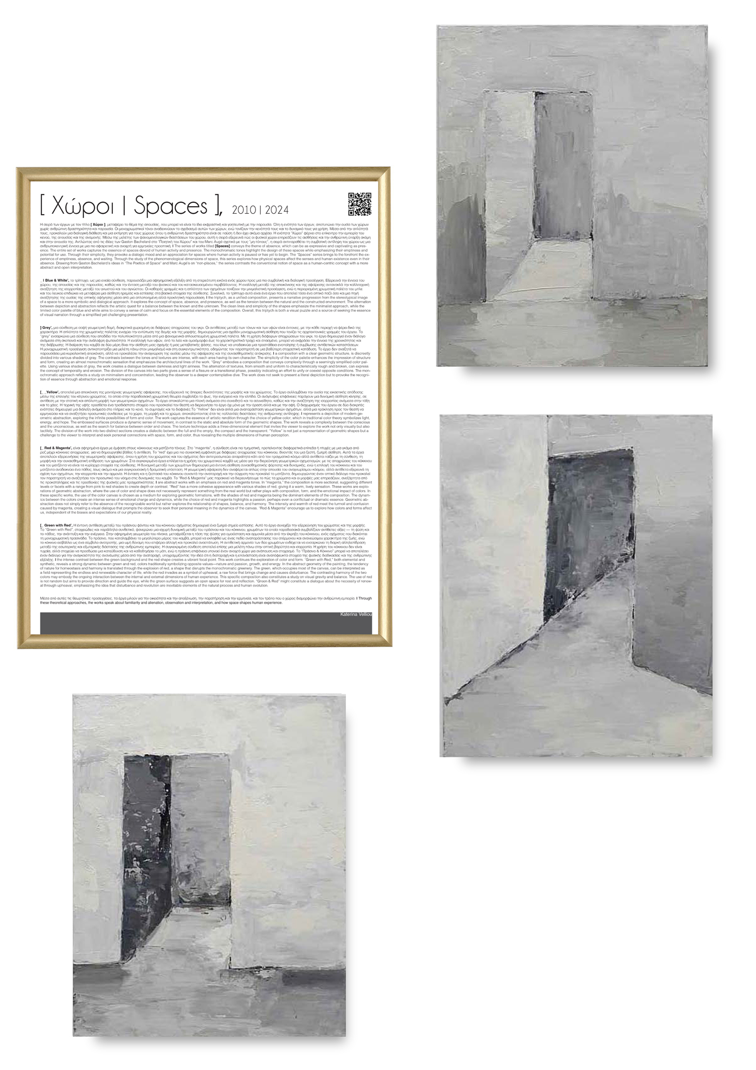
The series of works titled [Spaces] conveys the theme of absence, which can be as expressive and captivating as presence. The entire set of works captures the essence of spaces devoid of human activity and presence. The monochromatic tones highlight the design of these spaces while emphasizing their emptiness and potential for use. Through their simplicity, they provoke a dialogic mood and an appreciation for spaces where human activity is paused or has yet to begin. The “Spaces” series brings to the forefront the experience of emptiness, absence, and waiting. Through the study of the phenomenological dimensions of space, this series explores how physical spaces affect the senses and human existence even in their absence. Drawing from Gaston Bachelard’s ideas in “The Poetics of Space” and Marc Augé’s on “non-places,” the series contrasts the conventional notion of space as a human-centric concept with a more abstract and open interpretation.
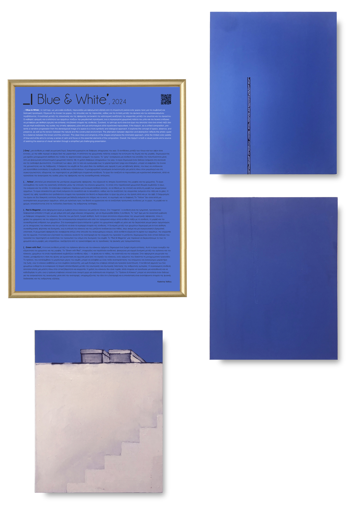
_ | Blue & White’, the triptych, as a unified composition, presents a narrative progression from the stereotypical image of a space to a more symbolic and dialogical approach. It explores the concept of space, absence, and presence, as well as the tension between the natural and the constructed environment. The alternation between depiction and abstraction reflects the artistic quest for a balance between the known and the unknown. The clean lines and simplicity of the shapes emphasize the minimalist approach, while the limited color palette of blue and white aims to convey a sense of calm and focus on the essential elements of the composition. Overall, this triptych is both a visual puzzle and a source of seeking the essence of visual narration through a simplified yet challenging presentation.
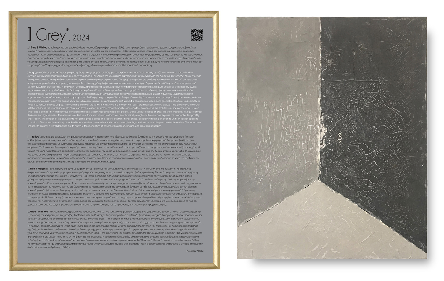
] Grey’, a composition with a clear geometric structure, is discreetly divided into various shades of gray. The contrasts between the tones and textures are intense, with each area having its own character. The simplicity of the color palette enhances the impression of structure and form, creating an almost monochromatic sensation that emphasizes the architectural lines of the work. “Grey” embodies a composition that conveys complexity through a seemingly simplified color palette. Using various shades of gray, the work creates a dialogue between darkness and light airiness. The alternation of textures, from smooth and uniform to characteristically rough and broken, can express the concept of temporality and erosion. The division of the canvas into two parts gives a sense of a fissure or a transitional phase, possibly indicating an effort to unify or coexist opposite conditions. The monochromatic approach reflects a study on minimalism and concentration, leading the observer to a deeper contemplative dive. The work does not seek to present a literal depiction but to provoke the recognition of essence through abstraction and emotional response.
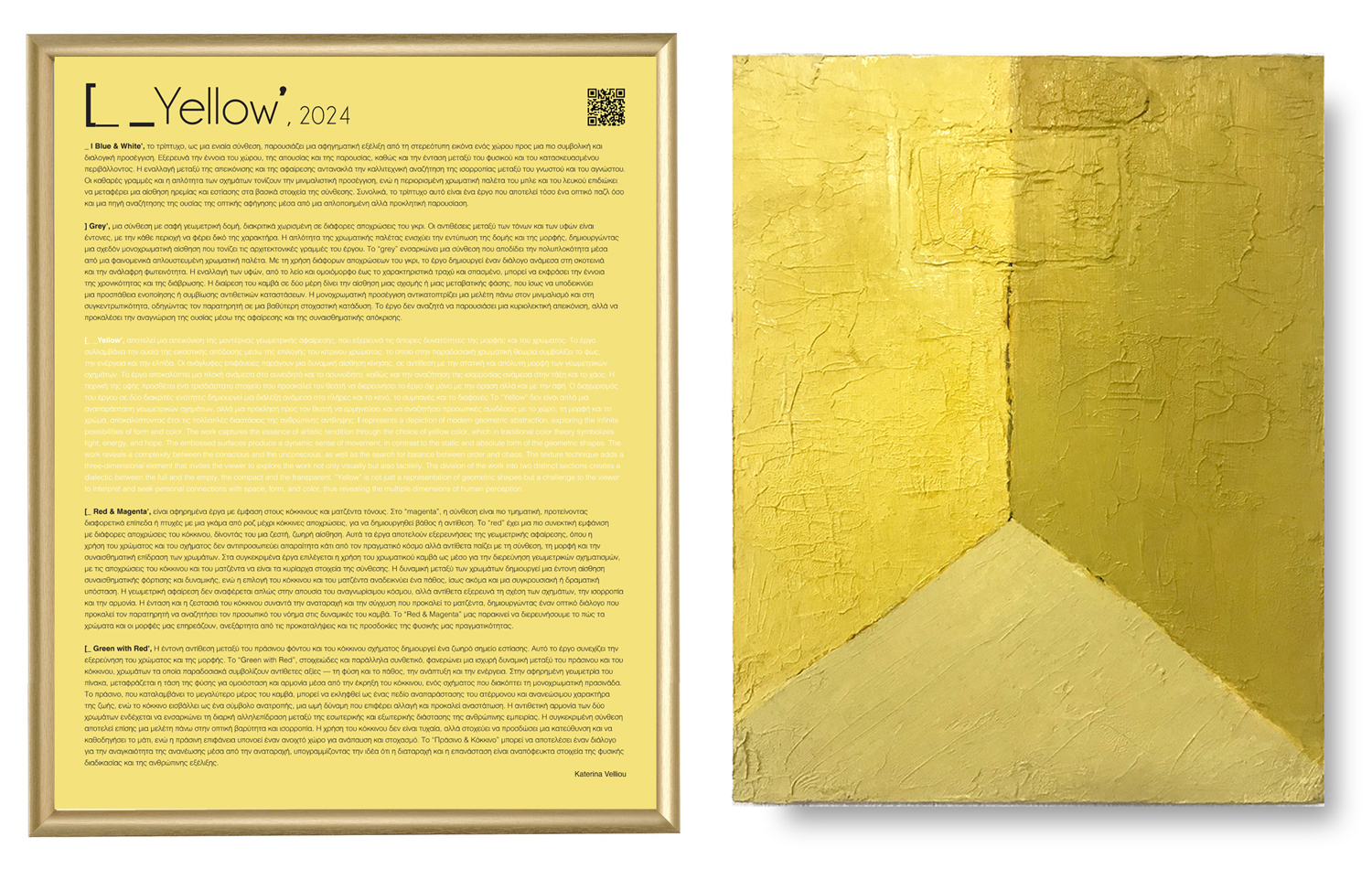
[_ _Yellow’, represents a depiction of modern geometric abstraction, exploring the infinite possibilities of form and color. The work captures the essence of artistic rendition through the choice of yellow color, which in traditional color theory symbolizes light, energy, and hope. The embossed surfaces produce a dynamic sense of movement, in contrast to the static and absolute form of the geometric shapes. The work reveals a complexity between the conscious and the unconscious, as well as the search for balance between order and chaos. The texture technique adds a three-dimensional element that invites the viewer to explore the work not only visually but also tactilely. The division of the work into two distinct sections creates a dialectic between the full and the empty, the compact and the transparent. “Yellow” is not just a representation of geometric shapes but a challenge to the viewer to interpret and seek personal connections with space, form, and color, thus revealing the multiple dimensions of human perception.
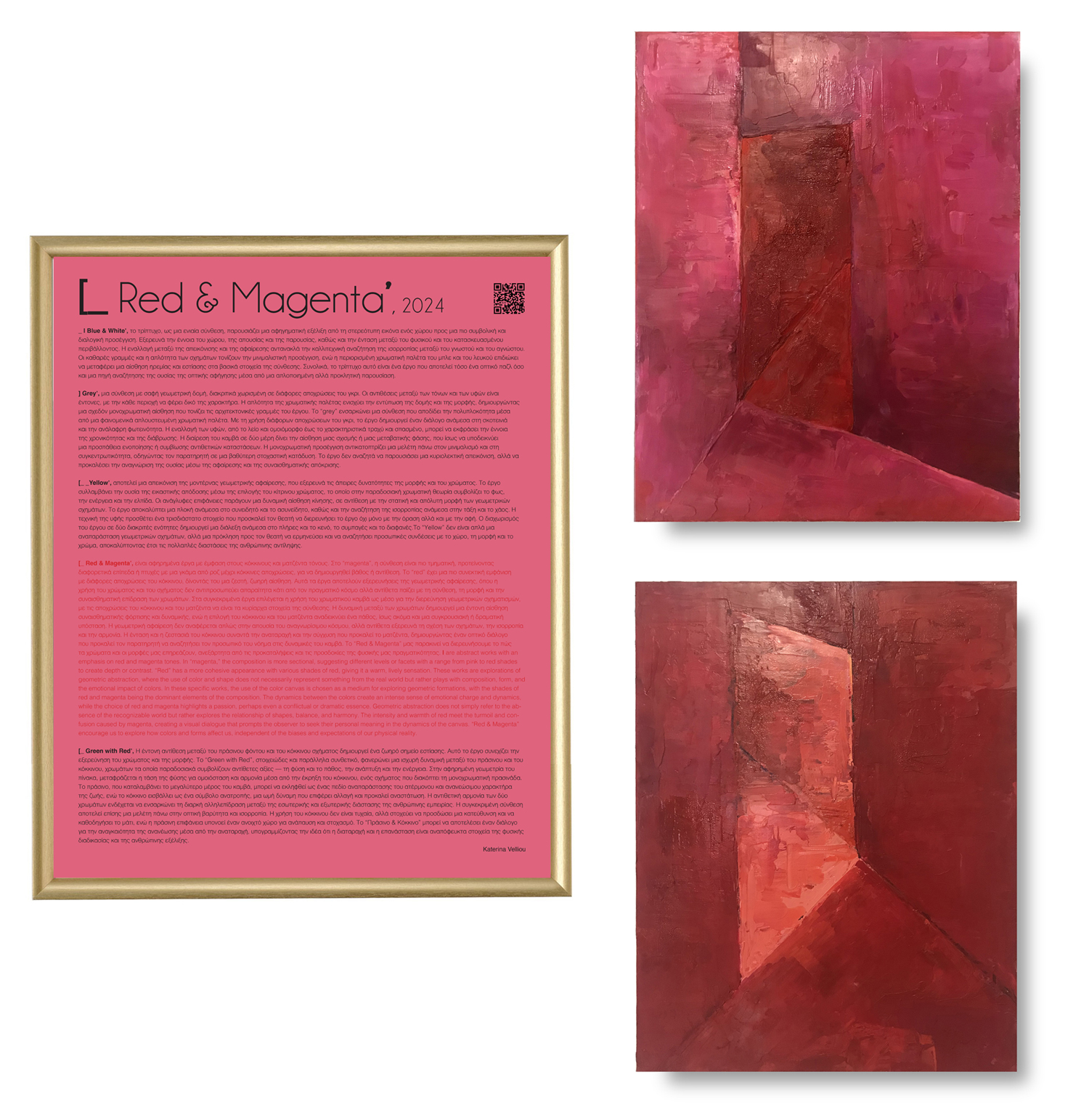
[_ Red & Magenta’, are abstract works with an emphasis on red and magenta tones. In “magenta,” the composition is more sectional, suggesting different levels or facets with a range from pink to red shades to create depth or contrast. “Red” has a more cohesive appearance with various shades of red, giving it a warm, lively sensation. These works are explorations of geometric abstraction, where the use of color and shape does not necessarily represent something from the real world but rather plays with composition, form, and the emotional impact of colors. In these specific works, the use of the color canvas is chosen as a medium for exploring geometric formations, with the shades of red and magenta being the dominant elements of the composition. The dynamics between the colors create an intense sense of emotional charge and dynamics, while the choice of red and magenta highlights a passion, perhaps even a conflictual or dramatic essence. Geometric abstraction does not simply refer to the absence of the recognizable world but rather explores the relationship of shapes, balance, and harmony. The intensity and warmth of red meet the turmoil and confusion caused by magenta, creating a visual dialogue that prompts the observer to seek their personal meaning in the dynamics of the canvas. “Red & Magenta” encourage us to explore how colors and forms affect us, independent of the biases and expectations of our physical reality.
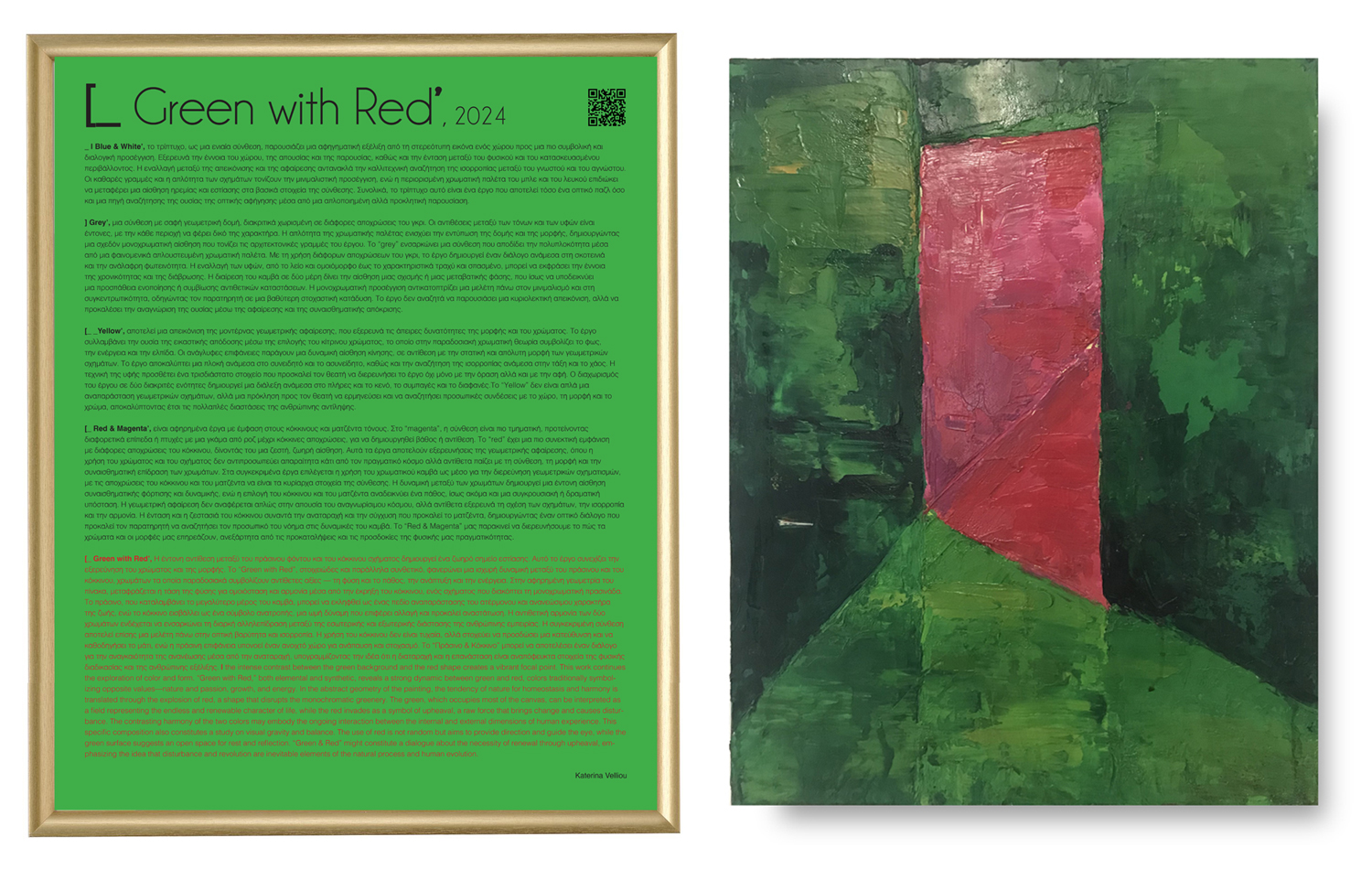
[_ Green with Red’, the intense contrast between the green background and the red shape creates a vibrant focal point. This work continues the exploration of color and form. “Green with Red,” both elemental and synthetic, reveals a strong dynamic between green and red, colors traditionally symbolizing opposite values—nature and passion, growth, and energy. In the abstract geometry of the painting, the tendency of nature for homeostasis and harmony is translated through the explosion of red, a shape that disrupts the monochromatic greenery. The green, which occupies most of the canvas, can be interpreted as a field representing the endless and renewable character of life, while the red invades as a symbol of upheaval, a raw force that brings change and causes disturbance. The contrasting harmony of the two colors may embody the ongoing interaction between the internal and external dimensions of human experience. This specific composition also constitutes a study on visual gravity and balance. The use of red is not random but aims to provide direction and guide the eye, while the green surface suggests an open space for rest and reflection. “Green & Red” might constitute a dialogue about the necessity of renewal through upheaval, emphasizing the idea that disturbance and revolution are inevitable elements of the natural process and human evolution.
Through these theoretical approaches, the works speak about familiarity and alienation, observation and interpretation, and how space shapes human experience.
[ Spaces ], 2010 | 2024
Oil on canvas, digital print text, gold frame
Tetraptych, 50 x 40 cm each
[ Spaces ], _| Blue & White’, 2010 | 2024
Oil on canvas, digital print text, gold frame
Tetraptych, 50 x 40 cm each
[ Spaces ], ] Grey’, 2010 | 2024
Oil on canvas, digital print text, gold frame
Diptych, 50 x 40 cm each
[ Spaces ], [_ _Yellow’, 2010 | 2024
Oil on canvas, digital print text, gold frame
Diptych, 50 x 40 cm each
[ Spaces ], [_ Red & Magenta’, 2010 | 2024
Oil on canvas, digital print text, gold frame
Triptych, 50 x 40 cm each